
8 Mistakes to Avoid When Building a Portfolio Website
Your portfolio website is often the first interaction someone has with your work. And let’s be honest—first impressions stick.
If your site feels clunky, outdated, or unclear, visitors might click away before even seeing your best projects. That’s a tough pill to swallow, especially if you’ve poured hours into building it. The truth is, even small mistakes can quietly sabotage your credibility.
But don’t worry—avoiding these pitfalls isn’t as hard as it sounds. Whether you’re a designer, photographer, or entrepreneur, knowing how to build a portfolio website that looks polished and professional is absolutely within your reach. Let’s make sure your site reflects the talent you bring to the table.
Why First Impressions Matter in a Portfolio Website
Humans are visual creatures. When someone lands on your portfolio website, they form an opinion about you in less than a second.
That snap judgment can set the tone for how potential clients, collaborators, or employers perceive your skills and professionalism. If your site doesn’t immediately communicate “I know what I’m doing,” you’ve lost them.
Let’s explore two key reasons why focusing on first impressions is a critical part of learning how to build a portfolio website that works.
How First Impressions Affect Your Career Opportunities
Think about this: Would you trust a hairstylist with messy hair or a financial advisor with incomprehensible spreadsheets? The digital equivalent is having a portfolio website that looks dated, cluttered, or—for lack of a better term—ugly. And yes, I’ve been there. My first few websites? Let’s just say they were a design disaster.
Your portfolio is your personal storefront, especially for creative professionals. Whether you’re a photographer, designer, or entrepreneur, people visit your site to gauge if you’re the right fit for their project or business.
According to Userbrain, a good design helps build trust and encourages repeat visitors. Poor design, on the other hand, can singlehandedly ruin your chances—88% of online consumers say they won’t return to a site after a bad experience.
A clean, visually appealing site communicates professionalism. It also sets the expectation that you’re detail-oriented, committed to quality, and have the creative chops to back it up.
If they can’t trust your visuals, why would they hire you for their project? In fact, Career Profiles reminds us that first impressions in web design are formed in 50 milliseconds. That’s faster than blinking! So, your site’s appearance needs to work immediately in your favor.
Here are three key elements that massively affect first impressions:
- Speed: Slow-loading pages? Say goodbye to visitors.
- Clarity: If it takes longer than a second to know who you are or what you do, your site is failing.
- Visual Appeal: No one likes janky designs, outdated fonts, or confusing layouts.
Personal Lessons Learned From Nearly a Decade of Website Building
Over the past 10 years, I’ve built, updated, and rebuilt countless websites—each one teaching me something new about how to build a portfolio website effectively.
Early on, I struggled with designs that felt clunky and amateurish. Looking back, I can sympathize with beginners. It’s hard to know what “professional” looks like when you’re just starting out.
The learning curve in crafting a professional site is real, but the payoff is totally worth it. My advice? Always revisit your portfolio with fresh eyes. If you wouldn’t hire yourself based on your website, it’s time to rethink the design.

First impressions are powerful. Whether it’s an intuitive layout, strong visuals, or impeccable grammar, every detail of your portfolio either boosts your credibility or detracts from it. Remember, building a great site isn’t about perfection—it’s about connection.
Common Design Mistakes That Hurt Your First Impressions
Now, let’s dive into the mistakes I see people make.
Your portfolio website sets the stage for how people perceive your skills and creativity. Unfortunately, common design flaws can stand in the way of making a great first impression.
Believe me, I’ve been there—I’ve made more than my fair share of mistakes in the early days of building websites. Let’s explore two design pitfalls that can derail your portfolio’s impact before it even has a chance to shine.
1. Cluttered Layout and Poor Navigation
Imagine stepping into a store that’s crammed with products stacked chaotically—you wouldn’t know where to start. A cluttered website layout is no different.
Overloading your pages with too much text, mismatched visuals, or unnecessary elements can overwhelm and disorient your visitors. Worse, it tells potential clients or employers that you might not have an eye for structure or detail.
Another frequent issue? Navigation that’s anything but intuitive. If users can’t quickly find what they’re looking for, they’ll bounce faster than you can say “back button.” I can’t count the number of times I’ve visited a site that buried its most impressive projects under endless clicks or vague menu labels.
What’s the fix? Embrace simplicity. Incorporate plenty of white space to give your content room to breathe. Keep navigation concise, clear, and consistent across all pages. It’s always better to have a clean, minimalist layout that highlights your work than one that distracts from it.
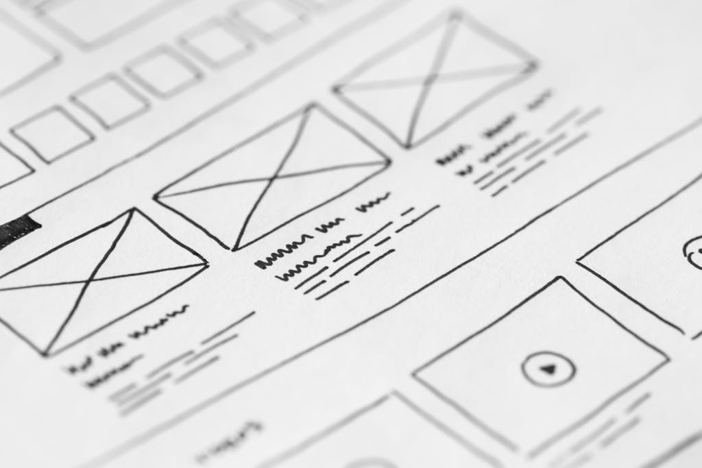
2. Unclear Visual Hierarchy
Visual hierarchy is what guides the eye—telling visitors what to look at first, next, and so on. It’s the backbone of effective web design, ensuring your message isn’t lost in a sea of visuals and text. Without it, visitors are left confused, unsure of where to focus their attention.
Here’s a good article on visual hierarchy principles if you want some more detail.
Picture this: a website where bold, eye-catching images overshadow important information like your name or services.
Even worse, inconsistent font sizes or cluttered arrangements can make your site feel chaotic. I’ve fallen victim to flawed hierarchies more times than I care to admit—it’s easy to think “more is more” when you’re just starting out.
But, as I love to say, oftentimes “less is more.”
To establish visual clarity, start with these basics:
- Use larger fonts for headers to grab attention immediately.
- Highlight your most important elements with contrasting colors or strategic placement.
- Keep everything else understated to maintain focus.
Remember, your portfolio isn’t just a gallery—it’s a story. Clear hierarchy ensures that story comes through loud and clear.
Website Content Mistakes That Undermine Your Message
Your portfolio website doesn’t just showcase your skills—it speaks for you, even before you get a chance to.
That’s why the stuff you include (and exclude) can make or break the user experience.
Unfortunately, many creatives unknowingly sabotage their message with poor content practices.
Here are 3 more tips that relate to your website content.
3. Problems Showcasing Your Work
Your portfolio is your stage—and your projects are the main act.
But all too often, creatives fail to present their work in a way that truly highlights their talent.
Outdated examples, a lack of context, or a haphazard arrangement can turn potential clients away.
Here’s what you can do to fix it:
- Keep it current. Outdated work signals that you’re out of touch or inactive. If you haven’t refreshed your portfolio in over a year, it’s time.
- Structure matters. Arrange projects strategically to create a strong narrative. Lead with your best work, and organize the rest to tell a cohesive story.
- Provide context. Don’t assume your work speaks for itself. Mention your role in the project, the problem you resolved, and the outcome. People want to understand your creative process, not just admire the finished product.
Think of your portfolio as a museum exhibit. Every piece should have a purpose, a place, and a plaque telling its story.
Without context, even your best efforts may leave visitors scratching their heads.
And let’s be real—if you’re hiding the role you played or how you contributed to the project, it might raise red flags for employers or clients.
4. Generic or Incomplete Information About Yourself
An “About Me” section that reads like a boring textbook—or worse, an X/Twitter/whatever-it-is bio—is a lost opportunity to communicate your value.
Your personal story, skills, and experiences should shine here. Skimping on this section can make your portfolio feel impersonal or, even worse, forgettable.
What makes a great bio?
- Connection: Write with your audience in mind. Are you speaking to potential clients, employers, or collaborators? Tailor your wording so they feel like you “get” their needs.
- Depth: Go beyond surface-level details. Don’t just say, “I’m a graphic designer.” Highlight your unique experiences or values that set you apart.
- Approachability: Strike a balance between professionalism and personality. It’s okay to include quirks or interests as long as they add to your overall brand.

Don’t undersell yourself with a lackluster bio. This is your chance to turn curiosity into connection, so make every word count.
5. Spelling or Grammatical Errors
You could have the prettiest website in the world, but if it’s littered with grammatical and spelling mistakes, visitors won’t take you seriously.
Typos and mistakes in your text send one clear message: “I don’t care about the details.” My mom is an English teacher, and I myself am a pretty detail-oriented person, so I can say—the details really matter.
Here’s how grammar impacts your portfolio:
- Perception: Errors suggest a lack of professionalism. Would you hire someone who can’t proofread their own work? Probably not.
- Trust: Polished content builds confidence in your abilities, while sloppy writing does the opposite.
Even for those of us who grew up with grammar drilled into our heads, it’s a skill that improves with practice.
You can use tools like Grammarly or Hemingway to catch mistakes when writing your website content, but don’t rely solely on them.
Commit to reviewing your content thoroughly before publishing it. Remember: if the words on your site don’t flow smoothly, visitors may assume your projects won’t either.
Taking the time to polish your web content is about putting your best foot forward. After all, your words are just as much a part of your portfolio as your visuals.
Technical Issues That Drive Visitors Away
Your portfolio website is a digital showcase of your talent, but even the most stunning visuals or compelling content can be overshadowed by technical issues.
These hidden flaws can quietly frustrate visitors, damage your credibility, and ultimately push opportunities away.
Let’s explore three common, yet easily fixable, technical problems that could be sabotaging your first impression.
6. Slow Loading Speeds
No one enjoys waiting around for a website to load—especially not potential employers or clients.
A slow-loading portfolio site feels like showing up late to an important interview. The sad reality? Many visitors won’t wait longer than a few seconds before clicking away.
Portfolio websites, in particular, often feature high-quality visuals that can slow things down if they aren’t optimized. Here’s what you can do:
- Compress images and videos. Huge file sizes are a major speed killer. I use free tools like CloudConvert and TinyPNG to compress images and reduce loading times.
- Enable lazy loading. This website setting ensures that only the content visible on the screen loads immediately, while the rest loads as users scroll.
- Use a god hosting service. Cheaper doesn’t always mean better; invest in a hosting provider that prioritizes speed and reliability. I’ve had good luck with Hostinger so far, and they’re plenty fast for my own websites.
On a more personal note, I’ve had to work on website speed too. It took me a lot of trial and error to learn why my websites were slow, and how to improve their speed.
Here is Google Pagespeed, the ultimate test of your website’s loading speed. They’ll tell you how fast your site is, and how to improve it. I use this tool almost constantly.
7. Not Mobile-Friendly
Please, do not ever say “but it looks good on desktop!” Your website should look good on all device types.
Mobile devices account for almost 70% of all internet use, and that number is only growing.
A portfolio site that isn’t responsive is like handing out a business card that doesn’t fit in someone’s pocket—what’s the point?
Responsive design ensures that your site scales beautifully on any device, whether it’s a smartphone, tablet, or desktop. Here’s why this matters:
- Impressions matter. A poorly designed mobile site screams “outdated,” which is the last thing you want when showcasing your talents.
- Google rewards mobile-friendliness. Search engines actively favor responsive websites, helping your portfolio rank higher in search results.
Testing your site is simple—just grab a phone and browse through every page.
Does everything look cohesive? Are buttons and links easy to tap? If not, it’s time to update.
Want more reasons to go responsive? This article on why responsive design matters explains the long-term benefits.
8. Broken Links or Missing Pages
Broken links are the enemy of a good website.
The infamous Error 404 popping up on your portfolio site can be enough to drive visitors away for good.
The impact of broken links stretches beyond annoyance:
- Credibility takes a hit. If your site isn’t maintained, clients may assume your work ethic could follow the same pattern.
- SEO suffers. Search engines penalize sites with too many errors, which means fewer people will even find your portfolio.
Fixing broken links doesn’t have to be complicated. Use tools like Google Search Console to locate missing pages or dead-end hyperlinks and update them promptly.
Keeping things polished shows professionalism and reliability—two traits every prospective client or employer appreciates.
These technical missteps, while common, are all fixable.
Whether it’s slow speeds, non-responsive designs, or broken links, addressing these issues can transform your portfolio site from a frustrating obstacle course into a seamless user experience.
Don’t let these mistakes overshadow your hard work. After all, when the technical side is buttoned up, your creativity and professionalism can truly shine.
Download My Free Website Design Guide
Ever feel stuck staring at a blank screen, not knowing how to start your website?
Or maybe you’ve been overwhelmed by the endless options for website providers, page builders, domain names, page layouts, and color schemes?
I wish I was able to avoid all the common mistakes I made when I was creating my first few websites.
That’s exactly why I created my Free Website Design Guide—to help creative, busy professionals like you learn about the best options to choose from (and a few to avoid!) for starting your website journey, no matter what your budget is.
Why You Need This Guide
If you’re a photographer, designer, musician, or any other creative professional, your website is more than just a portfolio.
This free, quick guide helps you:
- Choose the right tools: Whether you’re using a DIY platform or working with a designer, discover what your best options are
- Get the most out of YOUR budget: Not everyone has a massive website budget, so make sure you get the best value you can
- Get started in the right direction: Learn from my experience, and avoid some of my early mistakes
What’s Inside the Guide
What makes this guide so useful?
No fluff. It’s simple, easy, to-the-point. Nothing but my own advice, tips, and wisdom for navigating the oddly confusing world of website design.
You’ll learn about the best tools for building your own website, avoiding website builder companies that overcharge, and best practices for hiring a web designer.
Here It Is!
Download the free guide right here.
Practical Steps to Improve Your Portfolio Website
Now that we’ve looked at some common mistakes, here are some practical steps for improving your portfolio site.
Prioritize Clarity and Simplicity
Think of your portfolio website like a well-organized toolbox. If tools are scattered everywhere, it’s hard to find what you need, right?
The same rule applies to web design. A clean and simple layout ensures that your work shines instead of getting lost in visual noise.
Here are a few ways to focus on clarity:
- Stick to 2-3 font styles maximum. Too many fonts can come off as unprofessional and messy. Think of it like choosing a color palette for a painting—less is more.
- Use white space strategically. Let your content breathe. Crowded pages are overwhelming and drive visitors away.
- Choose visuals with purpose. Images and graphics should support your narrative, not distract from it.
I’ve learned this the hard way. After nearly a decade of trial and error, I’ve realized that simplicity isn’t just elegant—it’s effective. If you’re starting from scratch, check out this guide to portfolio simplicity for inspiration.
Regularly Test and Update Your Website
A portfolio is not a “set it and forget it” deal.
Times change, your work evolves, and so should your site. Outdated links, broken pages, or old content make your site feel neglected.
Protect your first impression by routinely doing the following:
- Fix broken links. Dead links slam the door on a professional experience. Use tools like Google Search Console to catch them.
- Update case studies and projects. Your latest work shows your growth and relevance. Replace older, less-impressive pieces every six months or so.
- Audit performance. Speed is everything. Compress your images or switch to a faster hosting provider if your site starts to lag.
Gather Feedback From Peers and Professionals
Here’s a secret: You’re too close to your own work to spot all the flaws. It’s like trying to proofread your essay after staring at it for five hours—your brain just glosses over the mistakes. That’s why feedback is essential.
Not sure who to ask? Start with:
- Peers in your industry. Designers, photographers, or anyone who understands portfolio standards can offer valuable insights.
- Former clients or mentors. They know what works in the real world and can help pinpoint what’s missing.
Conclusion
First impressions matter, and your portfolio website is no exception. Avoiding these common mistakes isn’t just about making your site prettier—it’s about showcasing your professionalism, attention to detail, and creative expertise. A clean, well-structured portfolio sets you apart and helps visitors connect with your story from the start.
Building a great portfolio site takes time and practice. Don’t be afraid to learn through trial and error—mistakes aren’t failures; they’re just steps toward improvement. If you’re a beginner, focus on small, meaningful tweaks rather than aiming for perfection. Your work deserves a platform that does it justice, and with consistent effort, that’s exactly what you’ll create.
Now it’s your turn. Take a hard look at your site, start fixing what’s holding you back, and make your first impression one that sticks. Who knows? That next visitor could be the client or employer you’ve been waiting for.


2 Comments
Comments are closed.